Paddy Boi's Place
Monday, December 12, 2011
Final Project
For this post I went through the book one more time and looked at all the pictures and the one piece that really jumped out at me was the graphic imagery that April Greiman designed for Design quarterly, #133, 1987 entitled "Does it Make Sense?"
What I really like about this piece was how she took the limitations of early digital manipulation, such as low resolution imagery, and embraced them and incorporated it intro her work.
From the AIGA website, "Before the appearance of “Does It Make Sense?” designers widely considered bit-mapped type and imagery not only unorthodox but unacceptable, straying too far from the clean, crisp precision of the Intermational Style. The computer itself was viewed as cold and unfriendly, wildly expensive, and a harbinger of the demise of fine design. After the publication of Design Quarterly #133, many designers felt compelled to reconsider the role of the computer in design practice. Greiman's willingness to ask the question, and to place it at the center of the design community, triggered countless debates about computers, context, and creativity."
Here are a few other pieces that she has done that shows off this style
April Greiman was one of the first designers to see what kind of possibilities digital technology would have for the design world. What I also found out that I thought was really cool was she was one of the first designers to embrace the Macintosh platform as a artistic tool and used the MacDraw program to design the "Does it Make Sense?" It's pretty interesting to read about the challenges she had during the making of the poster.
Again from the AIGA website, "The process of integrating digitized video images and bitmapped type was not unlike pulling teeth in the early days of Macintosh and MacDraw. The files were so large, and the equipment so slow that she would send the file to print when she left the studio in the evening and it would just be finished when she returned in the morning. One morning, after she had arrived and was assembling the tiled image, it was clear that something big was missing. For some reason, her body had not printed, though everything else was there. While the technical details of the mystery of the missing body remained unsolved, its later reappearance on the pages presented another problem—Greiman didn't like the way her right breast looked. The reproduction process had flattened her and the light was strange. So, in what may well be the first MacDraw breast replacement; she cloned and flopped her left breast and placed it on the right side of her body."
Here's a more recent piece that she has done
If you want to learn more about this amazing designer, check out theses links.
An awesome collection of her posters http://madeinspaceshop.com/
Her design consultancy business' website http://madeinspace.la/
And her personal website http://aprilgreiman.com/
Wednesday, December 7, 2011
Field Journal - Module 10
The graphic designer who's work really resonated with me this week was Paula Scher.
Paula Scher is an American graphic designer and artist who has been the recipient of hundreds of industry honors and awards. She has developed numerous identity and branding systems for a wide range of clients such as Citibank, Bloomberg, Coca-Cola, Time magazine, and The Daily Show With Jon Stewart.
Artistically, she is known for for her paintings of maps with hand-painted labeling and lettering.
"It took me a few seconds to draw it, but it took me 34 years to learn how to draw it in a few seconds."
-Paula Scher
Wednesday, November 16, 2011
Field Journal - Module 7
The Artist who's work really caught my eye in this week's reading was Lester Beall.
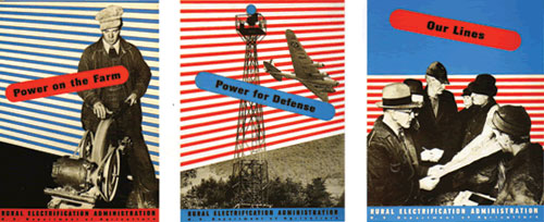
Lester Beall was a graphic design pioneer that helped usher in the explosion of modern graphic design in America in the late 1920s and 1930s. His use of bold blocks of color, strong angles and dynamic shapes was a major break from the traditional illustrations that were prevalent in graphic design during this time.
In 1937, Lester Beall created a series of posters for the Rural Electrification Administration. A selection of these posters were shown at The Museum of Modern Art which prompted the Swiss magazine, Graphis to write, "When The Museum of Modern Art in New York dedicated a special exhibition to Lester Beall in 1937, he was the first commercial designer to be honored in this way. It (thereby) paid tribute by its choice to the successful struggle for higher standards in American advertising."
-Lester Beall .
Monday, November 7, 2011
Subscribe to:
Posts (Atom)


